~Thanks for stopping by!~
Angie Holden The Country Chic Cottage
Learn about your Cricut machine, sublimation printer, or any other craft you can imagine! Angie Holden shares her crafting tips so you can craft like a pro!
Filed Under: Farmhouse Style Gardening
By: Angie Holden | | 19 Comments


~Thanks for stopping by!~

For over a decade, I have been sharing Cricut tutorials and craft ideas here as well as on my YouTube channel. My passions include teaching others to be creative and learning as many new things as possible about crafting technology! Click here to read more about me!


And subscribe to the newsletter!
The Country Chic Cottage is a participant in the Amazon Services LLC Associates Program, an affiliate advertising program designed to provide a means for sites to earn advertising fees by advertising and linking to amazon.com. Amazon, the Amazon logo, MYHABIT, and the MYHABIT logo are trademarks of Amazon.com, Inc or its affiliates. Please note that some products used may be given to The Country Chic Cottage free of charge.
Your sign is wonderful. Love the coke part. Hugs, Marty
This is awesome, Angie! Great job making it by yourself! 🙂 Love this!
That is great!
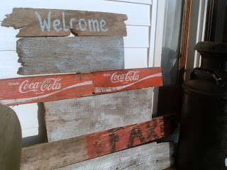
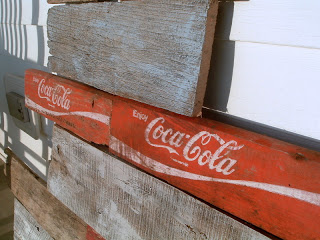
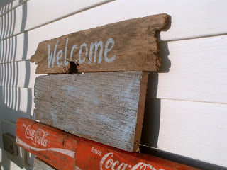
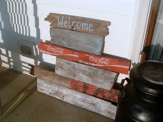
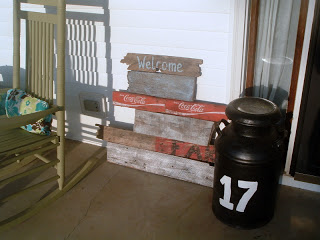
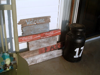
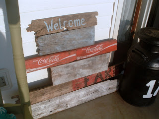
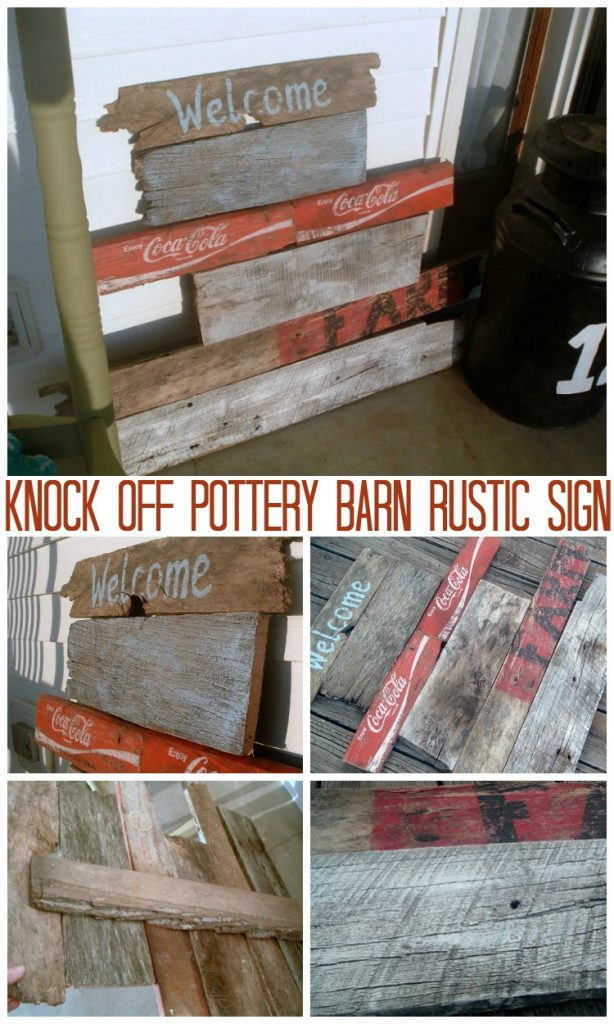
Cute! I love the Coca~Cola, Welcome sign! You did a great job…
Pat
great job! I just love old coke signs.
I love, love, LOVE this! Brilliant! It looks great. 🙂
This is so cool!
Would love if you linked up to my Delightfully Inspiring Thursday Party, going on right now.
http://delightfulorder.blogspot.com/2011/05/delightfully-inspiring-thursday-party.html
DaNita
Very nice…
I am IN LUV with your cute sign…
Oh my goodness, LOVING everything about this sign!!! Not so sure I’d trust myself to do all the tool work without the hubby though, I’m a little too accident prone! 🙂
-Angela
Oh my goodness gracious … I WANT THIS.
That looks AWESOME!
I’m getting ready to build some kind of pallet art – and this is definitely inspirational!
Great job!
You’ve got a new follower 🙂
~Bec @ littlelucylu
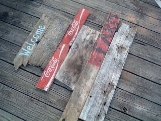
WOW! I love this! Thanks for the tips on the dry brushing.
How do I love this. let me count the ways: 1 for the shabby wood, 2 for the cheap copycat, 3 for the colors, 4 for the shabby wood, 5 for the coke sign, 6 for the shabby wood…Thanks for linking up to Beyond the Picket Fence!
Love this sign! Love the shabby wood, think you`ve heard that a couple of times, but I love it too…
Great job;)
Lovely greetings…
http://pudel-design.blogspot.com/
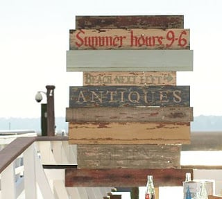
Angie, your Knock-Off was awesome!! You did a great job recreating that neat, rustic feel. I Featured this yesterday. 🙂
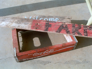
i’ve been looking for something to do with these. i have 5 of those old crates. thanks for the idea!!!
Beautiful knockoff! Thanks for sharing the dry brush technique too!
-caroline @ c.w.frosting
that is such a neat idea and a great way to reuse broken parts of old crates and such.
that looks pretty cool, i would have added the word “TO” on the the second board down from the top, and the word “OUR” on the third board down and on the last i would have added the word “HOME”………(Welcome To Our Home) ….but it does look neat